Google’s “mobile-first indexing” explained

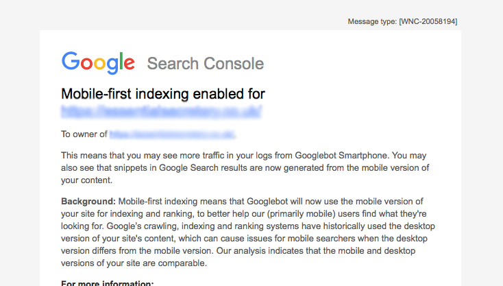
Had an email from Google telling you that “mobile-first indexing has been enabled”? We explain what this means and show you how you can improve the performance of your site with some quick changes.
What does this mean?
Google’s data tell them that more people now search the web using mobile devices than desktop. So it makes sense that they base their search results on the content and user experience that mobile users would see.
Since July ’18, Google has been rolling out mobile-first indexing. Rather than switching over to a mobile-first index immediately, it has been moving in that direction (slowly, some say). Their blog and emails suggest it’s done this way to benefit the user – although it’s more likely to allow them to identify and minimise any issues and not risk have their whole index go awry.
It means Google uses the data collected via its Google Smartphone bot to analyse your website and its relevance to searches.
Who does it affect?
Most sites have used “responsive” code for their websites for the past few years. This means the underlying content is the same for all devices, just with different display rules employed depending on the user’s screen size.
Some older sites still use mobile-specific content (often called “m dot” sites, as many used the web address ‘m.example.com’).
A few have no mobile or responsive version and just render the desktop version on mobile. Cue lots of pinch-and-zoom user behaviour, followed by profanities and the user looking for an alternative website shortly afterwards.
What should you do?
Below are summaries of quick ways to optimise you website, no matter which kind you have. While you’re making changes to your site, see if you can make the site faster as well (for example, optimising the images), which Google also likes.
- For responsive sites, mobile-first indexing means little changes – Google sees the same content as when it looked at desktop. Your focus should be on the usability issues that Google now takes into account, such as:
- text size
- the size of buttons and links
- if the size of the viewport (browser window) is defined.
The best place to start is Search Console – see what Google identifies as a problem, if anything, and speak to your web designer about making the changes.
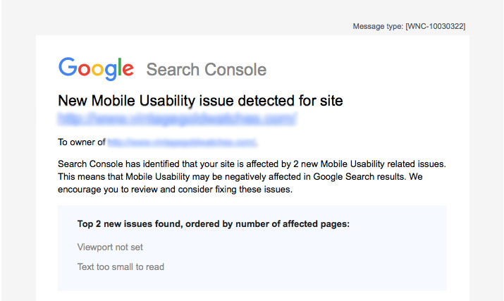
In the example above, Google has highlighted that as well as the text being too small to read on a mobile, the viewport is not set. This means the desktop format of the site (ie. landscape) would show on a mobile phone (which has a portrait format), resulting in both horizontal and vertical scrollbars. Either speak to your web designer to get this amended, or if you’re comfortable with code, put this into the header section of your website: <meta name=”viewport” content=”width=device-width”>
2. For mobile-specific sites, the impact will depend on how different the content is to your desktop sites – plus the usability issues that responsive sites are judged on. A good start would be to look at Google Analytics data for your mobile and desktop sites, and see where there are any large discrepancies in data (especially in terms of the bounce rate and exit rate) This will identify pages where you should improve your mobile version.
You could also do a comparison of mobile and desktop content for your top pages, and identify where mobile content could be improved.
Finally, take a look at Google Search Console and resolve the mobile usability issues it identifies (as explained above).
3. For sites with no mobile version, the content Google sees will still be the desktop version – but it will be marked down due to the usability failures for mobile devices. The simplest route for improvement would be to:
- introduce responsive styles, so that your site can respond to device screen size and be more mobile-friendly
- make sure you pay attention to text size and how easy it is to click on links
- hide any content that won’t work well (or at all) on mobile, such as Flash
In truth though, if you have a site that was built before mobile became important – it’s probably out of date now and needs redesigning!
Like what you see? Get in touch