Fonts: For print, for the web & the rest

Fonts, or as us designers call them, typefaces, are the secret sauce to having a piece of good quality marketing material. Choose the right typeface and you’ve got yourself a rich and considered piece of designed communication. Choose the wrong one and it’s game over and you may well have designed it in MS Paint or worse still, Powerpoint.
Let’s get something established up front. A typeface is the family of the alphabet that follows a certain style, such as Times New Roman, Gill Sans or Johnston. A font relates to the style and weight attribute, such as italic or condensed styles.
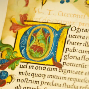 For hundreds of years, going back as far as the middle ages, monks created ‘illuminated’ pages in their bibles and scripts, and these pages were drawn delicately in ink and embellished with golf leaf. Very often, they were letters or words that were important to the text. Writing in latin, these monks turned the act of writing down their religious messages and stories into an art form. Different orders of religions developed different styles of writing and so the typeface was born.
Since then thousands of typefaces have been designed and as art styles changed through the decades and centuries, they have influenced design fashion. Some fonts are so iconic in their style it’s possible to tell the era from which they came.
Well-known typefaces include the likes of Helvetica, Futura, Gill Sans, Univers, Interstate and Johnston. The latter two gaining infamy for being used in the design of the most mundane but practical places of road signs and the London Underground: Interstate is the most widely used font for road and street signs (except the UK for some reason); Johnston is used as the typeface of London Underground since the early 1920s. These typefaces enter the designers’ typeface hall of fame for their cleanliness and legibility whilst carrying off well-proportioned characters, tracking and kerning.
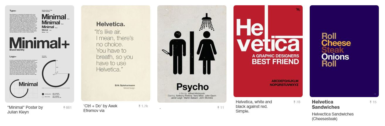 Some beautiful examples of Helvetica.
However, there are others that, from a design perspective, should be banished. These include the likes of Verdana, Brush Script and Comic Sans. The latter being globally detested by the design community.
A piece of design is nothing without type and it is the key to making a brochure, a logo or a website either a thing of design success or utter failure.
The purpose of this article is to give you an insight into the more practical side of typefaces or fonts as they are more commonly but incorrectly known.
Background & definitions
Fonts used in the artworking of all printed material need to be fully postscript. This means they are fully vectored letters that can be scaled up or down to an almost-infinite size without loss of quality. It’s a format developed in the 80s by Adobe. These fonts are known by two names:
Postscript and Open Type fonts. They have the full range of all the characters, numbers, special characters and can be used for foreign languages, too. They are for use with professional design packages, such as Adobe Illustrator, Photoshop and InDesign. Developed by Adobe, there were several ‘types’ of postscript font with varying quality of reproduction but the aim was produce a consistent look and standard for all fonts and variable sizes across different devices – screen and laserprinter.
As with all fonts, you have to have the font files installed on your computer to be able use and see them.
You can read more about the details of font format development history here on a useful Wiki page.
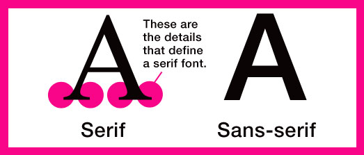
Serif and sans-serif
At this stage it’s worth providing a little bit of technical explanation to the question “what’s the difference between serif and sans-serif fonts?”
Simply this: The serifs are small end-piece details or small decorative flourishes on the ends of some of the strokes that make up letters, numbers and symbols. For example Times New Roman font is an old and commonly-used serif font. Sans-serif (‘Sans’ is French for ‘without’) doesn’t have these flourishes. The best example of a sans-serif font is Helvetica.
Fonts for the web
When the internet was in short trousers, the technology didn’t exist for web browsers to be able to display whatever font you wanted. Browsers were only really able to support a range of around 10 fonts – Times, Georgia and the computer’s default serif font along with a handful of sans-serif fonts such as Arial and a few others. The offering was uninspired and web designers circumvented this meagre range of fonts by turning the words into graphics using Photoshop and replacing them on the web page with an image of the word instead of an editable typeface.
These were sad and limiting times for a designer as it meant plain fonts were chosen that didn’t necessarily fit a company’s brand. This made the consistency of design between online and traditional printed marketing pieces slip.
Then came web fonts – early methods were a bit hit and miss and meant you could convert your client’s company postscript font into a TTF (TrueType Font) format – and with some clever coding you could ‘call’ that font to display on the web page. The problem was that not all browsers supported it and very often reverted to a default font and things looked inconsistent again. TrueType fonts were created by Apple and Microsoft in competition to Adobe’s Type 1 postscript font format. However, postscript format was what the professional industry chose as the standard for high resolution artwork.
Things improved and in recent years. Font foundries (yes, that’s where they make fonts) are making new fonts that have both postscript and web versions available.
More recently, Google have realised that if the web is to improve, better support of fonts is a must. They have developed open access to a huge range of excellent fonts that mimic the style of some of the well-used and liked fonts so that websites can now have stylish type that’s not an immovable image of a word.
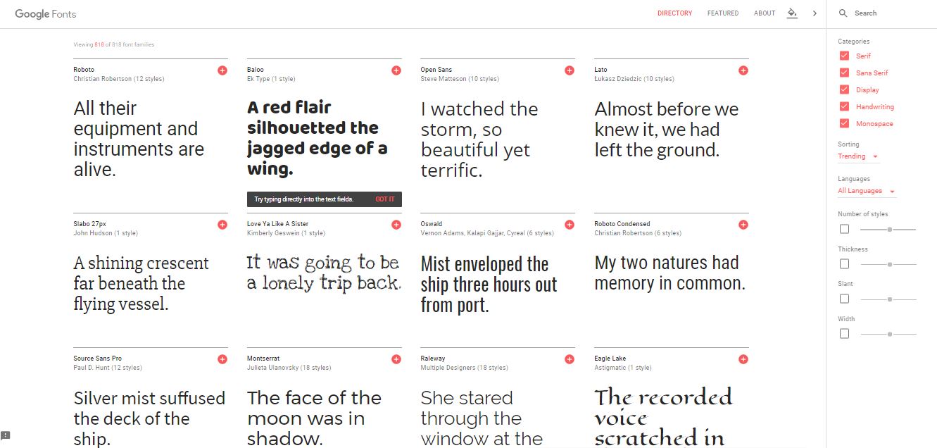
There are currently over 800 fonts that all web developers have access to and can encode into your website. You can see them at fonts.google.com
The rest
When I say ‘the rest’ I mean fonts such as those used in ‘Microsoft Word and Powerpoint documents’, desktop Paint or image editing applications and how emails look (including email signatures and marketing HTML emails).
In short, these all use screen-only system fonts (TrueType format). These fonts are often installed on the user’s computer and are for just that user to produce documents, print stuff out on a personal laserprinter or inkjet or make PDFs.
They are not for use in the production of professional artwork, marketing material or on websites.
Email signatures and nice-looking HTML marketing emails are also best made using only these system fonts as it requires the recipient to have the non-standard font on their computer otherwise and this is unlikely. If you want something special-looking, a few words or the logo made as images will be fine, but you cannot have your email signature in Papyrus font or something equally horrendous.
And finally – font licenses
Fonts, just like images, music and other digital material, need to be licensed to use legally. If you do not have a licence to use it (basically, buying it from a reputable font foundry or graphic supplies website, you face the possibility of the licence holder (the font foundry) coming after you to pay the licence fee or in the worst case, taking legal action against you.
As a designer, when we produce a piece of artwork, whether a logo, brochure, poster – whatever – we eventually need to provide that artwork to the printer and so to avoid us falling foul of the law, we ‘outline’ all the fonts in that artwork. That’s where the ‘postscript’ element comes in from earlier.
Using professional design applications, such as Adobe Illustrator, we can turn those postscript fonts into shapes, albeit sophisticated ones, that show as each letter of a font family. That way we don’t need to provide the font family to the printer and break the licencing rules.
Most people don’t know it but asking your designer to hand over the fonts is the same as asking them to copy their music collection and give it to you. It’s basically piracy unless the font has an open-use licence policy.