Colour me bad(ly)

Knowing the difference between Pantone®, RGB, CMYK, what to use and when.
The colour landscape
If you work in marketing or the creative industry you will, of course, know of various ways to name colours. From Pantone to CMYK through to RGB and Hex along with lots of other phrases in between.
The important thing is to know which ones to use and where.
All too often we see designers and developers given Pantone colour references for when they’re designing websites or the colours in artwork that are marked up in RGB when it’s got to be printed on a brochure. Uh-oh.
So, we thought it would be useful to provide a basic, but nonetheless useful, guide as to what colour references to use and where so as to avoid both misunderstanding and, more importantly, unexpected results.
The basics
Let’s start with the absolute basics. Put simply, there are colour charts used for:
- Printing stuff (on paper, card etc.) for general marketing collateral.
- The web (websites, emailers and also videos – anything displayed on a screen).
- Objects (exhibition stands, corporate HQ walls, furniture etc).
They each have different charts and colours available because of one simple reason: the inks from which they are made are different because of the surface on which they will be used. Additionally, if it is for the web or screen, the colours are made from light frequencies rather than pigment in ink.
Let’s start with printed stuff
We’re talking about business cards, brochures, leaflets, etc. – anything that gets printed on a paper-based material or where the printing is applied to the surface of something, such as a pen with a company logo on it. This method uses inks with pigments in it.
When it comes to printing stuff, there are only three ways to specify colours:
Pantone® (also known as spot colours), CMYK (also known as four-colour process) and digital printing (we’ll address this one at the end).
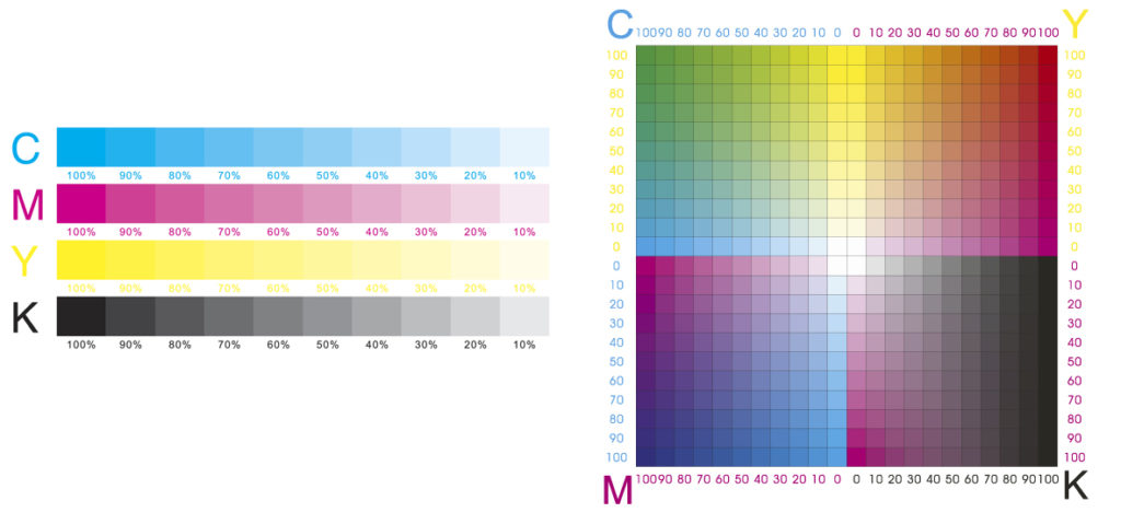
CMYK (An acronym made up of the four base colours of Cyan, Magenta, Yellow & Black (represented by the letter K from the old days when black was used as the ‘keyline’ – hence ‘K’ for keyline.). The image below will be familiar to you. This process is the most common and provides us with all the colours of the rainbow (give or take) and allows us to print in full photographic colour. It used to be the most expensive, but nowdays much less-so and is the most commonly used. The upside is you can print photos. The CMYK inks are mixed together in different percentages to achieve an infinite number of colours, really. Downside is that sometimes solid colours can appear a little dull or ‘muddy’.
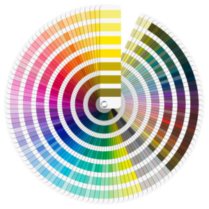 Pantone® – which is actually a trademarked name, is a system of solid colours that are solid, vibrant and come in 1867 different colours. They are displayed in swatch books, like the one opposite, and are used to specify a very particular colour usually in addition to CMYK or instead of when just printing one or two colours. They cannot be mixed with CMYK but can be printed as extra colours on specific areas.
However, they have no relevance on the web or anything that is displayed on a screen.
Pantone® colours are made up of 20+ different special pigments to achieve the exact colour. It’s the best way to achieve a consistent colour from one place to another but is not suitable when printing things that have photos.
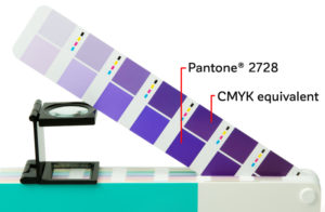
There are CMYK equivalents to the Pantone®colours but very often they are approximations as the colour made from four based colours cannot possible be exactly the same as one made from possible 20+ pigments.
This example shows you the CMYK equivalent of a Pantone®colour. For the record, the blue range of colours comes out worse than any other.
 Pantone®spot colours are also used when printing a logo or something simple on a physical object, such as a company branded pen or umbrella.
Printing objects
Ink used for objects is done in a similar way as the Pantone®method from a range of about 20+ base pigments mixed together to get the desired colour – just like a recipe: 1 part translucent white, 2.5 parts magenta and so on – just like at the Dulux machine in the hardware store.
As an example, if you are painting the company HQ reception area with the colours from the branding guidelines, the decorators will take the Pantone®colours and match them as close as they can – usually by colour matching them on the Dulux or Crown colour systems or by matching the Pantone®swatch to the Dulux or Crown swatch.
CMYK, RGB or Hex colours are not appropriate here.
Then there’s the web
Or more accurately, anything that appears on a screen.
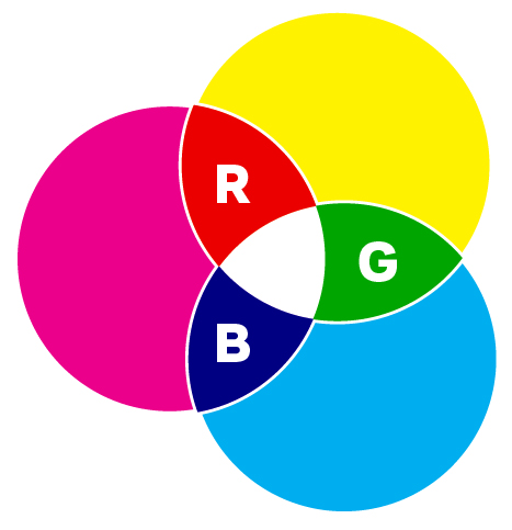 These colours are made up completely differently. Colours on screens are made up from the base system where colours are made from Red, Green and Blue light. You’ll recognise image opposite from school science lessons but in short, the colours are made from overlapping different percentages of the three colours (or light bands).
As you’ll remember from school, all three colours fully intersecting will produce white as white light is the culmination of the three colour bands.
So, for all colours that are used on screen and therefore made up from light, they all form their basis in RGB. However, there are 2 different forms of ‘colour charts’ to display colour on screens.
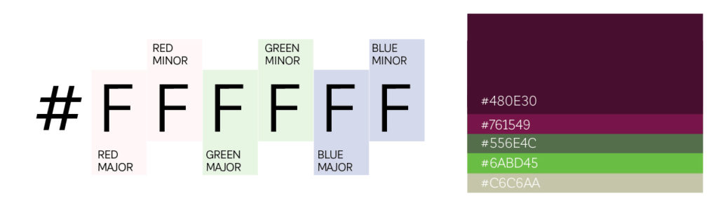
HEX Code
Back when the internet was in short trousers, the browser rendering engines weren’t as sophisticated as they are today and so the number of colours that could be displayed on screen was limited to a 6-digit HEX CODE (hexadecimal) range and has its basis in RGB colour range. Colour on web pages were displayed by using the HEX colour code in the HTML/CSS and was written with a leading symbol of ‘#’, such as #000000 which happens to display 100% black.
A colour is specified according to the intensity of its red, green and blue components, each represented by eight bits. There are 24 bits used to specify a web colour, and 16,777,216 colours available to specify. Here’s an example:
Using HEX code to specify a colour for use on screen is accurate and consistent but is, like all things on-screen, completely dependent on how well the screen is calibrated. We won’t go there in this article but a colour specified in HEX code on a TV will look very different to how it looks on, say, an iPad.
More latterly, web code requires the use of RGB for accuracy…
RGB (Red, Green, Blue)
As I have already mentioned above, RGB is the base method of displaying colour on all screens. However, by specifying a colour in RGB, the developer can have greater control of the hue, saturation and tint of the colour by adjusting the numbers in each light band from 0 to 255 across all three light bands and allows the colour to have a better chance of being consistent across many device screen types. However, it’s a little more labour-intensive to code than just typing a HEX code. RGB colours are displayed in code like this:
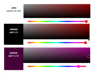
(R:255 G:255 B:255) is white
(R:0 G:0 B:0) is black
and this nice aubergine
colour is (R:71 G:2 B:57)
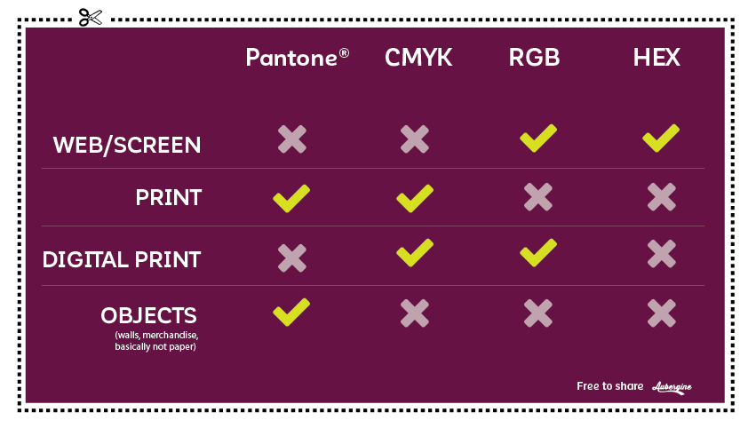
Got it? Let’s move on to what colour system to use and when.
When to use it
There’s no point over complicating this. Put simply, it’s as follows:
A few extra things to note
Photos taken on a digital camera or smart phone are taken in RGB because their first place to be displayed is the screen of the device. When you want to use an image from a digital camera (even when supplied by professional photographers) or from a smart phone on something that is going to be printed, such as a brochure, the image will need converting in Photoshop (or similar) to CMYK. However, you won’t need to do this if it is only going to live on a website or displayed on a screen.
Digital printing
This one’s the exception to the rule – there always is one.
Digital printing machines are a bit like super-sophisticated colour printers. But unlike your inkjet or colour laser printer, these machines use lots of colour pigments to make up colours – some high-end digital printing machines have as many as 11 colour ‘cartridges’ so they can make up all the colours from the CMYK range but remain vibrant. Because it is digital and not four metal plates pressing ink onto paper, artwork or images supplied in RGB will be converted so that it prints as close as possible to the vibrant colours from RGB but are still made up of ink being placed on the paper – albeit from 11 different cartridges rather than four.
Here, you don’t specify Pantone®or HEX. However, you can specify the colour in either CMYK or RGB as the image that’s printed will be based on (at least) the four base colours plus a load more depending on the size of the digital printing machine.
Phew! I’m all crayoned-out! I hear you say.
It’s not as hard as it may seem as long as you remember the basic rules as shown in the grid above.