Cool design for a hot day…
So, with all of the unseasonably good weather, we decided that the studio was far too hot to concentrate and we needed to cool down. The first thing that came to mind was ICE CREAM!
That got us thinking…
Back in the day, the only chance you got to see ice creams was when the ice cream van drove around where you lived (usually at tea time when our mums refused to let us out). We then started to talk about the classic ice creams and lollies.
We each have our favourites for different reasons – but here’s ours.


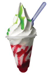
Mark’s favourite – “for me it has to be a screwball – you get a cool pot, the whippy ice cream, the sauce and then
the bubble gum at the end. Not to mentioned the coloured plastic spoon you can use as a flicking device”
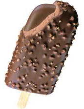
Bekki’s favourite – “it HAS to be a Feast – all that chocolate and then the extra solid chocolate chunk in the middle…MMMmmm”
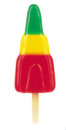
Joe’s favourite – “It TOTALLY has to be a Zoom – I can’t eat ice cream so the fruit combo ice lolly is the way to go – and the best way to chill down”
James’ favourite – “I’d say it has to be the king of ice cream, the Cornetto”
Harry, our young designer’s favourite – “A Fab – it’s a design ice cream classic.”
But WHY do we each favour different lollies and ice creams?
Is it because of what they taste like? Or is it more deep rooted and linked to what they look like and their packaging that affect our decision?
One thing about all the ice creams from those days is that they packaging was very bright, garish colours and aimed directly at kids. However, these days, ice creams are expensive and have design-driven packaging to make you think you are getting a premium product that is exclusive – a good example of this is a Magnum. The packaging for this brand has been elevated to exulted levels over the years and it has been know that ice cream vans to sell single Magnums for £5 each. Bonkers, I know.
However, this is not a new thing. The first of the new pretenders in terms of ‘posh ice creams’ was Cornetto. As a kid, standing at the ice cream van looking at the Cornetto that was £1.50 was like looking into a Ferrari showroom – no chance of ever having one, just looking at it was enough. The packaging was stylish and a much better quality in terms of its whole experience when compared to a 30p choc ice or a 10p mini milk (prices as at the summer of 1979).
So, where do we go from here? Are we saying that there is little difference in the actual ice cream product itself and that the inflated price tag is purely based on the perceived premium value? Or are the products really that much better?
We think that with a few notable exceptions, it’s mostly about the branding and packaging and that you could take two identical ice creams and brand them up in two very different ways to appeal to two different market groups and create two different experiences.
The same can then really be said across any product – you can package and brand any item to be targeted at any demographic provided that the branding style is right.
Having said all of that, it’s now time for us to wrap up as our lollies are all melting.

