Graphic design excellence – Liberty’s packaging
From time to time, there are examples of graphic design excellence that we come across that we feel need acknowledgement – out of respect and gravitas to the designer and also to champion the reasons why we think they are examples of excellence.
I have started this series of blog topics to explore and give examples of these to show that graphic design is everywhere in everyday life and that without it, the world would be a dull place with no top brands to aspire to or, quite simply, nice things to look at and covet.
 My first example is Liberty in London. Liberty has been a retail experience since the 18th century – with the shop opening in 1874 by Arthur Lasenby Liberty of Chesham, Buckinghamshire (yes, nor far from us!). You can read a proper, more authoritative history on Wiki.
Since then, the drive and whole ethos of the store is to excel in every possible retail interaction and make the experience unique.
With this in mind, I felt a trip was needed to remind myself. I was stunned. From the moment of walking into the old store, you feel immersed in a time capsule. Whilst all the top brands are there with the usual point of sale, everything is positioned and displayed in the best possible way.
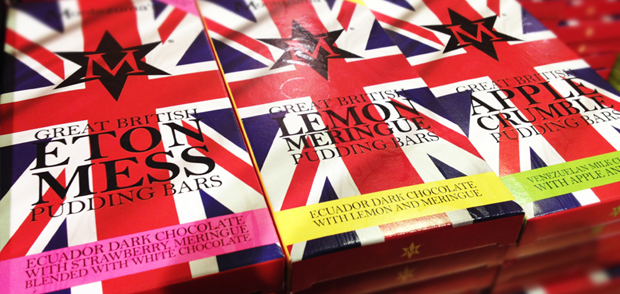
One aspect of the experience that stands out, both as a graphic designer and as a fan of good retail examples, are the brands of chocolate Liberty offer – Prestat, Charbonnel et Walker and Montezuma. We are bombarded with designer brands of chocolates these days – with ever more efforts by the designers to make the packaging look more and more exclusive to justify the ever-rising price tag. This, in itself, is not an issue as such – but they have all tended to follow that ‘Hotel Chocolat’ style.
However, Liberty are different with their choice. The designs are completely different from one range to another – taking inspiration from different design styles and eras – all on the same shelf. This gives a fantastic retail display that, whilst looking visually different, works as a whole.
Perfect examples are the ranges of bars of chocolate that are designed in standard cardboard box constructions but are graphically so very different they appear to all be made of types of material. A brilliant use of graphics, images and typography to make the difference between essentially the same cartons.

With a mixture of print treatments – embossing, foil blocking, spot colours, varnishes and laminates, the packaging design is, in our opinion, an example of graphic design excellence and one with which to aspire to as a designer.
At Aubergine, although sadly not yet been invited by Liberty to design packaging for their next range of luxury goods (there’s still time!), our experience in packaging design spans more than 20 years and we are proud to have helped launch brands into the marketplace with both brand creation, packaging designs and point of sale items – examples of which can be seen in our packaging design section.
In summary, when trying to sell a product in a retail environment, the packaging is very often the first point of contact your customer will have of your product and your company so it is vital that you make it memorable, appropriate to the product and marketplace and above all, making it obvious what is inside.
If you have a product that you think needs that Aubergine packaging design touch, call us on 01442 262840 or click here to send an enquiry if you prefer.
* We’ve used images taken from our trip to Liberty and the Liberty brand respectfully, but do not claim any ownership of them – we merely covet them as things of beauty!

