Graphic design in the commercial world – does it have a place anymore?

Let’s nip this contentious topic in the bud with a resounding ‘yes’!
Design is everything.
The way something looks and the style, brand and message it projects are the basis by which we all make a lot of our decisions.
An all-too popular example of this is Apple. It looks beautiful, the brand is cool – we all want to be associated with winners and good things and so we buy in to brands and the lifestyle they promise.
OK, let’s not jump on the Apple bandwagon just yet.
Recent design discussion posts on places like Linkedin (undoubtedly created by those that make software for wannabe designers) are perpetuating the very question of whether there’s a place for graphic design any more. With software in the market that makes it (supposedly) easy for a non-designer to produce a poster or website that looks good without any design skill or talent, the design community are naturally feeling defensive.
Let’s start with the basic question of what is Graphic design? It’s the tool used to get a particular message across to its audience in a certain way and manifests itself in lots of different methods.
We think king of the hill is the UK’s very own Harry Beck. The originator and graphic designer who, in 1933, created the world’s first (and in our opinion) still the best example of an underground rail network – the London Underground.
Through the use of clever design element, colours and a key – Beck gets around the problem of scale and distance by creating the world-famous map within an artificial world of measurement and layout giving the user (yes, user, as this is the epitome of practical graphic design) the ability to work out where they are and how they get to where they need to go.
The proof of this is that, without exception, every other underground, rail and metro map follows the same design principle.
All hail to the Beck.
So, we began the topic with the question – does graphic design have a place in the commercial world?Evidence thus far has to point to the answer being; ‘yes’.
If we fast-forward to today, is that still the case?
Let’s take the visual brand phenomenon of Star Wars. Since George Lucas brought it to the screen in 1977, the visual feast has occupied our screens with cinematic brilliance. However, just as importantly, the likes of Kenner (and Palitoy in the UK) took the brand image and launched it into interstellar galaxies (sorry, I couldn’t resist) by using the design style on thousands of pieces of packaging, point of sale, shop marketing material and all the supporting printed matter to sell billions of figures, toys and Force-related plastic.
In even more modern times, with those who follow the antics of Skywalker and Solo, the design phenomenon is manifesting itself in modern art – using the style and essence of the original concept but being output in a modern medium of social art – art for the office, the home and lifestyle.
The bright star in this huge world of science fiction graphic design is an artist who takes the essence of Star Wars and creates pieces of modern and usable art whilst retaining that comical edge of the original movies by drawing on the undercurrent of humour from the films.
 Jason Christman, a modern science fiction designer from Oregon, U.S., takes some of those fundamental phrases from the original Star Wars films and captures them with a brilliant and stunning example of graphic design in a series of 12 pieces.
If it were not enough that the fans were buying these rare and limited pieces of artwork, Lucasfilms in partnership with Acme officially licenced the limited edition prints so that Christman’s work is forever formally associated with this seminal science fiction masterpiece.
We were lucky to have Jason Christman tell us that by using his minimalist style melded with his vintage and pop style, he has found a way to get across the humour of Star Wars that all true fans love. At the same time, ensuring that the actual design piece was accurate, especially when the field is so full of geeks who would shoot you down with an Ion Canon if you got any detail wrong.
At Aubergine, we’ve followed Jason’s work for a few years now and seen it emerge from the SciFi world and the preserve of the super-geek, into the mainstream art collecting world to make this artwork absolutely and unashamedly desirable.
As a graphic designer, the artwork gives on so many levels – flat, solid colours, plainness whilst retaining important detail, short, funny and in-the-know titles and that all-important ‘look’.
In the same way as today’s London Underground map still carries the look of the original map as designed by Harry Beck – Jason’s artwork achieves the same by projecting that ‘Star Wars look’ while maintaining his particular and minimalist graphic design style.
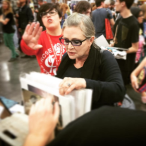 Followed by millions of fans as well as the stars of the screen too (captured here by Jason himself), is a photo of Carrie Fisher looking at some of his art at a recent ComicCon. The artwork is incredibly sought-after. Currently all of the Star Wars series limited edition prints are sold out but they can be found for those who search – but they change hands for big money.
So, we finish the article by concluding with our original question: Is there a place in the commercial world for graphic design?
Well, the Force is most definitely strong in this one.