What do many great logos have in common?

Many of the most famous logos have similar features… how does your logo compare?
Logos through the years have taken many forms – from icons and shapes with words to just simple typeface-based logos. If you think about the most famous logos, all of them are without exception simple words in a particular typeface (often called a font) that has since become synonymous with their brand. This includes companies such as Rolls-Royce, Twinings tea and Stella Artois. For some, the logos have been around over hundreds of years and have barely changed, apart from a few tweaks here and there, for either practical reasons or global style trends.
A lot of logos that were typeface-based from years ago were serif-based – by that I mean the letters had little extensions at the end of the main horizontal or vertical parts. These are known as the serifs.
In recent years we’ve seen quite a few major brands change their serif typeface-based logos to sans-serif typefaces, giving a more blocky, cleaner style.
The reason is that as the typeface gets smaller on mobile and table screens, the serifs were pixelating and breaking up. To a large degree, sans-serif typefaces don’t do this. There’s also a general style trend that surrounds serif fonts being a bit old fashioned, too.
Let’s start with the most famous logo change in recent years, our Partners and friends:
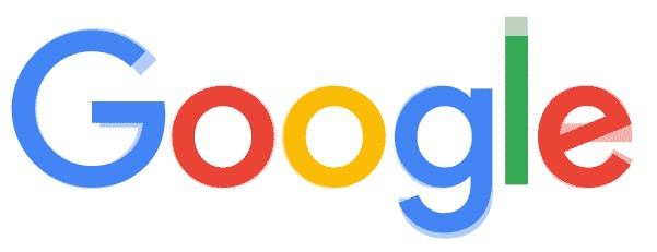
1. Google
You’ll recall their logo pre-2015:

Now look at their logo. The new logo is based almost entirely on the very famous Futura typeface designed by Paul Renner in 1927, but with a few adjustments for that subtle brand statement. For the record, their old logo was in the typeface, Garamond.
You’ll see how the word written in Futura (just visible as a pale shadow) is slightly different to the logo when overlaid:
2. easyJet

The logo (and all its derivatives) are based on the typeface, Cooper Black.
3. Apple
The text part of their branding (as their main logo is just, well, an Apple icon) is San Francisco Pro Display & Helvetica Neue.
4. London Underground
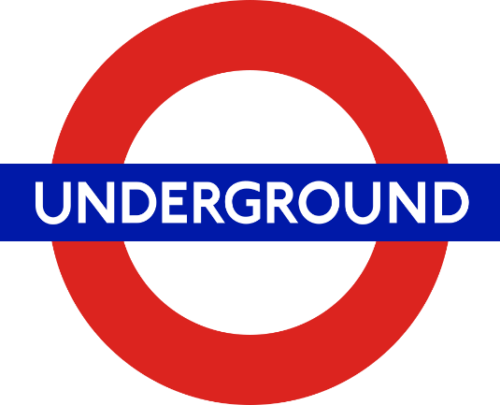
The original typeface was designed by Edward Johnston in 1922. There have been a few variants over the years to work out some practical application issues from the original, but the version used today is a 1997 adjustment by Jonathon Paterson of the original typeface P22 Johnston.
5. BBC

The original logo typeface was Gill Sans (which is the same historic typeface used by the London Underground for many years in their promotional material, designed just a few years after the original 1922 P22 Johnston typeface.)
6. Sonos

The typefaces used in the logo is a slightly tweaked version of Gill Sans and Future BT Medium. The logo appears to be made up mostly of the Futura font with the ‘S’ being tweaked.
7. McDonald’s
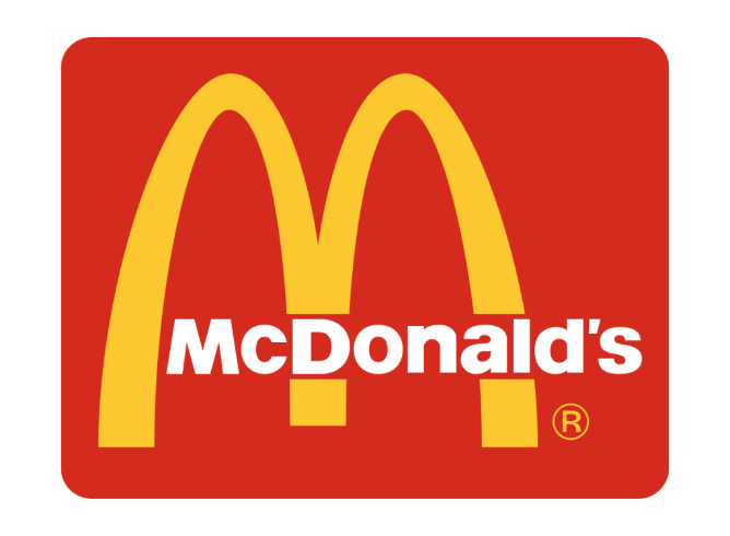
The typeface, excluding the ‘M’ remains unchanged since its conception in 1962 and is Helvetica Neue Black. Although McDonald’s have used many typefaces in the other marketing material over the years, the typeface of the logo itself hasn’t changed. Helvetica can also be found in the logos of Jeep, Americal Apparel and Lufthansa – as well as many, many others.
8. Facebook
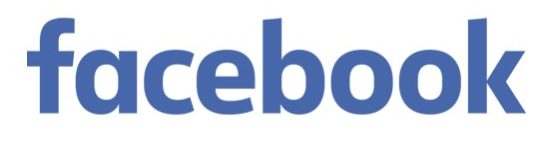
Probably the most famous ‘f’ on the planet! The typeface used in the full logo was changed a few years ago and is now very based closely on Klavika Bold.
9. eBay

The typeface used in this famous logo is Univers Regular.
10. Adidas

Adorned by sports professionals and hip-hop legends, the logo’s typeface element remains unchanged and uses ITC Avant Garde Gothic Std DemiBold.
11. GAP
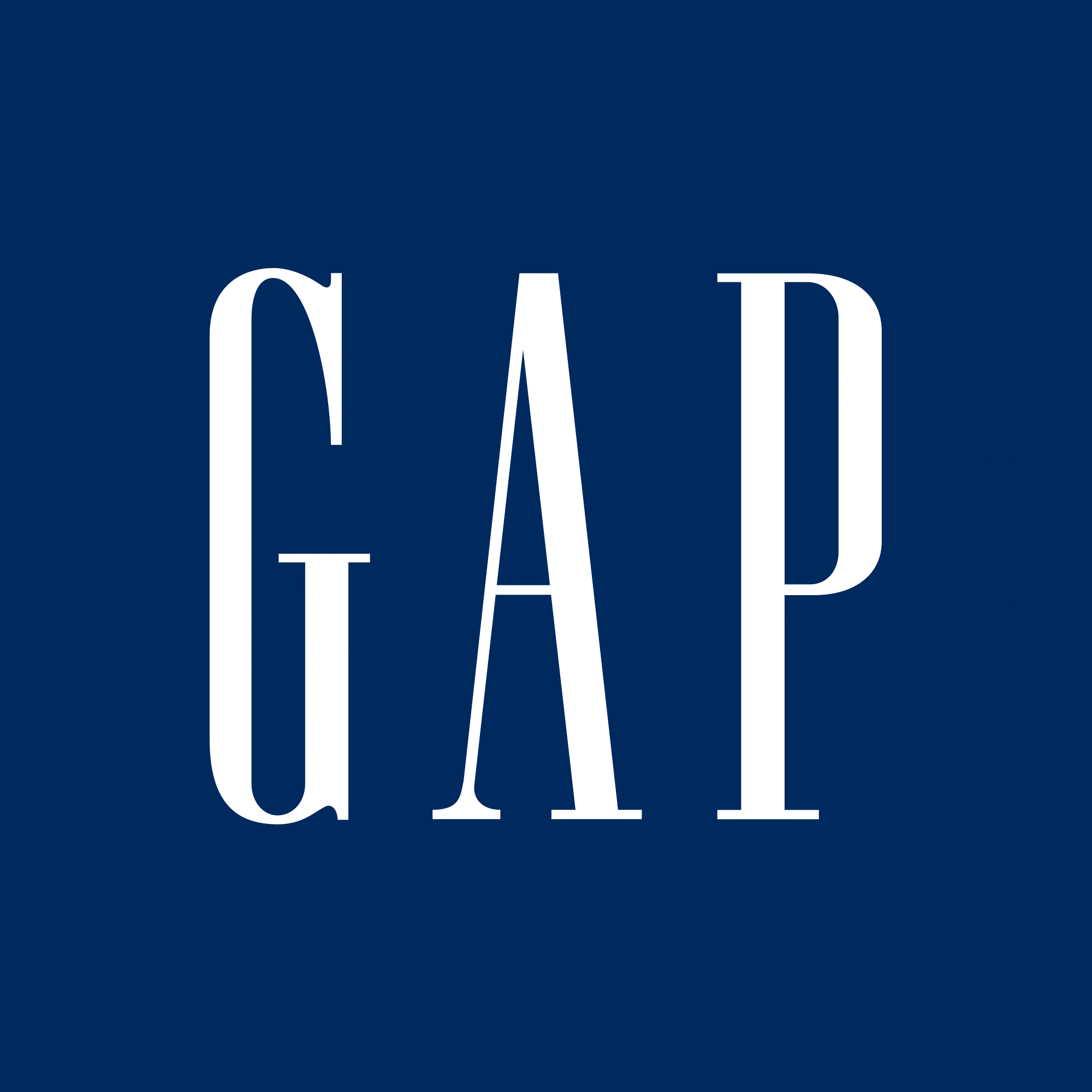
The typeface used in the logo is Spire (they had a global rebrand in 2012, but the new logo lasted just six days before they decided to revert back to the original).
12. Amazon

Recognised the world over, the typeface used in the logo has never changed and is ITC Officina Sans Bold.
13. PayPal

PayPal have had a few variations of their logo over the years, but the current logo uses a typeface based heavily on Verdana Bold Italic.
14. Linkedin

This gigantic corporate entity uses an equally gigantic corporate typeface, Myriad Pro Bold, created for Adobe and more recently adopted by Apple as their standard body text typeface.
15. Twitter

The typeface has remained unchanged for its logo and is based almost completely on PICO Alphabet. However, Twitter were recently criticised for changing the body text font of their website and app from Helvetica Neue to Gotham. The flying Twitter bird has had a few facelifts in its time.
For what it’s worth, we think it was the right move, Twitter.
A final observation
What’s very interesting in these purely randomly-picked famous brands is this – the typefaces used in the majority of the logos were all created in the early 20th century. Futura, Helvetica, Gill Sans and Avant Garde are all approaching 100 years old. Yes, there are a couple of more recent typefaces in the examples, but if you look at them all together (ignoring the colouring) they all share one simple attribute – they are all sans serif typefaces. What’s also interesting is that they all come from a time when graphic design was emerging as a recognised skill and something that anyone who needed to communicate something needed to make better use of.
For the record…
I have used the above logos without direct permission from each of the organisations purely to demonstrate examples within an editorial piece. If you represent any of these brands and wish me to remove them from this article you can contact us through the general enquiry form on our website. Alternatively, if you have a process by which we can seek formal permission, we’d welcome the direction from you.