The importance of keeping brand image consistent

We explore the reasons why choosing a look – and sticking to it – is vital for business
One of the key issues brand managers and business owners face when it comes to their brand image is ensuring it remains consistent across all marketing pieces.
When it comes to physical products or marketing material, they have a reasonable degree of control. Internal quality control will handle how the brand appears on products and the marketing matter is usually controlled from a few, central teams. From a practical point of view, the master artwork and imagery will be only accessible by the organisation and so there is complete control both in terms of adherence to brand guidelines and quality of content of any printed material.
It starts to slip a little when the brand is of a significant size – the marketing and brand managers send the brand and logo assets, along with the brand guidelines, out to advertising agencies, designers, web developers and partners to spread the load and responsibility across the country/world. There are likely to be local variations and interpretations to meet cultural differences, but as a rule, the brand marketing pieces in print or physical assets are kept reasonably consistent.
However, online use is very different. Brand and marketing managers face a daily battle to control how the brand is perceived, aiming to make sure it remains as consistent and ‘on-brand’ as possible. Inconsistencies in branding and messaging can lead to consumer and customer confusion and mistrust.
Businesses have complete control over their brand image on their website – that’s not the problem. It’s the peripheral locations, such as the social media channels, partners’ and distributors’ websites and other advertising platforms that are a problem because they have varying degrees of control. And beyond that is then how the public and internet users will use the brand.
Why is it so important?
In these times of counterfeit products, fraud and scams, maintaining the brand image is vital – it’s the way customers recognise the business as official and the original. But it’s hard.
Whether a small or large business, a lot of time and money will be invested into making sure that the business is positioned in the best possible way. Ideally new or potential customers should feel:
- They can trust the brand
- It’s reliable
- It meets the level of quality they’re expecting
- It projects the brand’s values, whatever they may be.
Meet these and you’ve got the best possible chance to convert an enquiry or potential customer into a real one.
Why is it so hard to control use online?
A brand is made up of much more than just a logo. A good brand consists of assets, such as:
Logos and icons Most brands need to have a logo pack that contains a few variations of the logo image so that it can work in a variety of situations – a default tone that would be used on a white background, a white-out version that would be used to reverse out of a colour or image, and then a few derivatives for use in specific ways. There’ll sometimes be a logo with a word, sometime just the word and sometimes just the logo. Here’s an example using the brand image of our friends, Lindal.

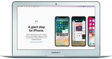
Photography You may not think that photography style is that important (as long as it’s in focus and so on) but you’d be wrong. There are many subtleties to brand photography that you would notice if it wasn’t there. Brands spend millions on photography, both for products and those that represent the brand. Think Apple. The photography style is synonymous with their brand – you could spot it anywhere and you would know the brand just from the photo.
The same can be said for other image types, such as lifestyle and photography, where the aim is to project the brand and its values in order to promote a service or brand message. Consumers and customers have the innate ability to subconsciously recognise the brand that is being advertised from the photography or style of filming.
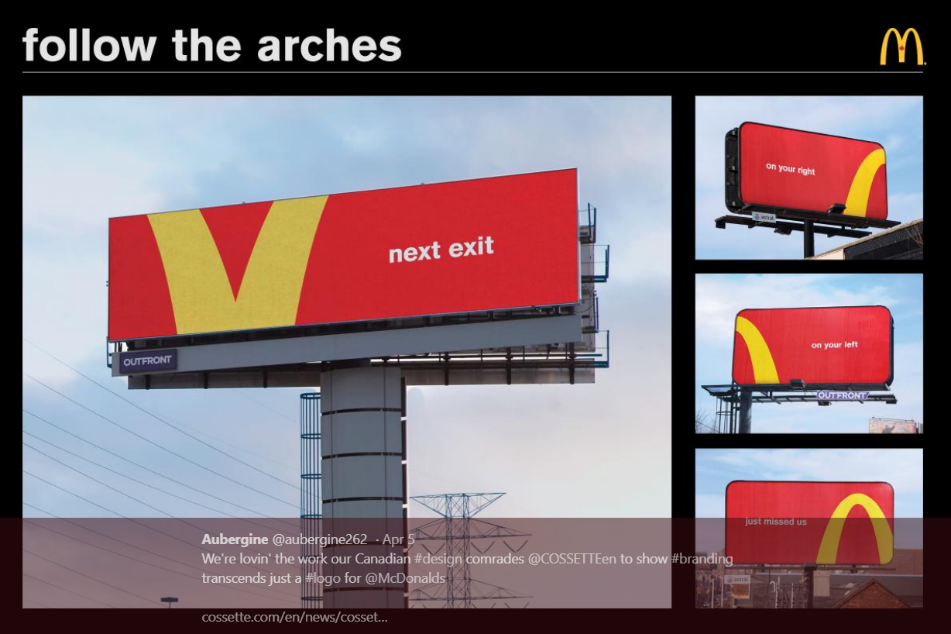
Colours and fonts An integral part of the brand image are the colours and font (or typefaces as they should be correctly referred). They make up the look of the brand as strongly as the logo itself. There are many brands that have gone to the lengths of commissioning a custom typeface. A couple of the famous ones include The London Underground and their typeface, Johnstone P22 and its subsequent Gill Sans update; BlackBerry with their font based on two others – Harabara Mais and Nimbus; and of course, the most famous of all (although you may not realise it) is Times New Roman. It was commissioned by The Times newspaper in 1931 and then became widely available with the advent of desktop computers.The downside of custom typefaces is that they can’t be easily used on websites. Thankfully, Google and other web services have made it increasingly easy to access and use vast numbers of web typefaces (or Google Fonts as they incorrectly call it) so that brands can ensure they keep the typestyle on the website the same as that on other mediums, rather than settle for system typefaces. A word of note on colours – most organisations have their own set of colours that they use to project the brand image. A recent and exceptional example of how colour has become synonymous with a brand is the campaign by Canadian agency, Cossette, for McDonald’s. Using JUST colour and a very small portion of the logo, these gigantic billboards succeed in making the hungry driver subconsciously think of McDonald’s.
Videography The look, tone and style of video for both TV, cinema and YouTube are also powerful tools to reinforce brand. Examples of this include the obvious and notable Coca-Cola adverts, particularly the Christmas campaigns (‘Holidays are coming’), Apple’s original iPod TV campaign and the design legend Honda’s ‘Cog’ advert. What they all have is a live visual representation of the brand – colours, tones, language and style – all blended into something that is recognisable, even if you remove the logo. Whilst millions have been spent on these extreme examples, back down on Earth the principles remain the same for any businesses thinking of producing video for a website. It’s vital to ensure that any graphic assets are all in accordance with the brand guidelines, in terms of fonts, colour and messaging, in order to retain brand consistency.
Tone of voice When we start discussing the creation or update of a brand, one of the questions we often ask our clients to think about is, if money was no limitation, who they would like to present their adverts and voiceovers – who is the voice of the brand? It’s a great ice breaker and gets people starting to think of famous people and hearing them in their head. It’s amazing how many time Morgan Freeman tops that list. However, this exercise is more important than you might think. That tone of voice – both in terms of the audio and the written language – sets the personality of the brand. If you want to resonate with a certain type of person, you need to use language and tone that they will voluntarily listen to (products aimed at millennial tech lovers will need to use different language to those aimed at 60-something gardening enthusiasts, for instance). The way language is presented on a website and marketing material is a significant determining factor whether someone converts from a visitor to an enquiry or customer. You can read a fuller guideline on Tone of Voice in our previous article.
Summary
Used in a controlled way (and according to some carefully created brand guidelines), all of the above components make up the overall look and feel – from typefaces and colours, to the spacing of text and headlines, to how the photography has been taken and which filters applied. They all build up a brand image. Keeping that consistent on the largest and most wide-reaching platform of the internet is crucial to ensure that the customer base feels assured and confident to buy from you.
Please note: I have used the brand images and screenshots purely as a visual example to demonstrate and support the editorial. We make no claim or ownership of any part of these images.