How to use Google Analytics for in-depth website analysis

In our previous article (see it here), we showed how to create a weekly ‘health check’ in Analytics using Dashboards – this time, we’ll show you how to set up an in-depth analysis.
Google Analytics provides a lot of data. So much, it can start to become a mass of numbers. But by identifying the data that really matters to a business and setting up a ‘dashboard’, you get everything you’re interested in in a much clearer format. This will make it easier to spot trends (both positive and negative). Here at Aubergine, they either validate our ongoing marketing efforts or alert us to changes we should make.
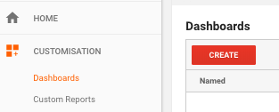
To begin your own dashboard, log into Analytics, go to Customisation > Dashboards, and click the Create Dashboard button:
Give it a name (differentiate it from your Weekly health check from our first article), choose Blank Canvas, and hit CREATE (make sure to set your date range to the last 3 months, and compare it to the same period last year).
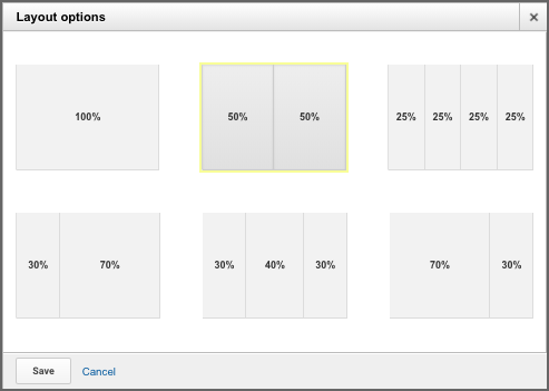
Then, we recommend changing the layout – the widgets that are created have 3 months of data and it’s important to see the detail, so change the layout from the standard three-column version to either 50/50 or a single column – to do this, choose Customise Dashboard (at the top right of the Dashboard screen) and select the layout you prefer.
Now you’re ready to go. The first check is exploring big picture, ie. the source of visits to the website, and the longer-term trends.
a) In the Add A Widget box, choose a Standard Table, set the Dimension to Source, then add a metric of Users and a metric of the key conversion (here, we’ve shown Goal Completions). We set this to 5 rows, which keeps you concentrated on the most important sources:
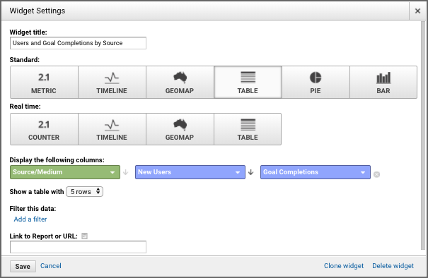
This table gives you an overview of the quarter – but it’s only a scene-setter. It’s also useful to see trends over time, for each source of visits. For this we’ll include the Timeline widgets:
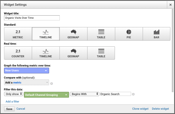
b) For each of your top sources of visits, create a Timeline widget – in this example, we’ve created a widget with a Filter of the Default Channel Group “Organic” – it will monitor the progress of our efforts to get visits from non-paid search (“SEO”). You use the Filter for each widget to define your key visit sources.
The graphs produced give the underlying details of the longer-term trend. Things to look out for are:
- are the gains/losses consistent, or is one big spike/gulf distorting the figures?
- what’s the most recent trend – and is it up or down?
- can you relate any of the movements to your marketing efforts?
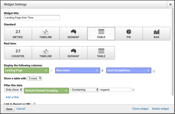
c) For the third set of widgets, look at how the most important landing pages for each of the top sources of visits are performing in terms of visits and conversions:
Keep an eye on both positives and negatives – which pages are performing well, which ones aren’t. Dig into any opportunities and issues, for example:
- if a new blog post is one of the top performing pages for organic search, what can be learnt from this?
- if the landing pages for paid search have started performing worse in terms of conversions, has something changed in your AdWords campaign and why isn’t it working?
- if the homepage is getting fewer visits, is it because the business has not been focusing on PR efforts this year and the negative effects are starting to show?
These simple steps will provide you with your dashboard. But it’s only a snapshot – so be prepared to delve into the detail (we open Analytics in a separate window and flick between the two).
Make sure you have a regular analysis routine – diarise it and set a reminder. Remember the aim is to look at longer-term trends and identify what is driving them, to inform your long term marketing strategy.
(Want to save time setting up your dashboard? OK – here’s a link to the dashboard template: https://analytics.google.com/analytics/web/template?uid=Q3IjkcgRR0Wa1jxl7kCQTA)